Meta’s COVID-19 Trends & Impact Survey Logo Design
A custom, new logo design for Meta’s COVID-19 Trends & Impact Survey Team.

Role
Software
Duration
Adobe Illustrator, Adobe InDesign, Adobe Photoshop
~ 1.5 Months
Logo Designer
Values & Goals
The COVID-19 Trends and Impact Survey (CTIS) brand was created in order to visually represent the team and their core values. In collaboration with the University of Maryland and Carnegie Mellon University, COVID-19 Trends and Impact Survey has been actively helping public health research and the fight against COVID-19 through surveys and data analysis. Through their work, CTIS ultimately helps with the crucial progression of COVID-19 related research and important policy-making decisions. Some core values of COVID-19 Trends and Impact Survey include ensuring the experiences of users are heard in an efficient manner and that the analyzed data is accurate and relevant
To reflect CTIS and its values, the brand utilizes various symbolic and visual representations inspired by the mythological whale creature, Cetus, and the overall pursuit of COVID-19 related data.
Brand Typography
Primary Font
The primary font chosen for the brand is Natom Pro as it uses circular shapes that help accentuate the roundness of the logo. Additionally, the angular terminals of the letters emphasize the sharp and more pointed elements of the logo. As a result of the round-bodied yet sharp letters, it reflects the exploratory, precise work and values of the team.
Natom Pro

Secondary Font
The secondary font, Bicyclette, was chosen as the geometric letters creates a sense of trust and reliability. The clean and well-balanced characters also emphasize a feeling of dependability and confidence, which accurately represents CTIS.
Bicyclette

Colour Breakdown
For the colors, various shades of blue-green and orange-red were used to represent CTIS.


The blue-green colors were chosen as a way to create a feeling of trust, reliability, and stability. Additionally, an orange-red color was used to create a feeling of enthusiasm, passion, and determination. Together, the blue-green and orange-red shades help create a dynamic and vibrant logo that visually represents the team’s work and values.
Logo Concepts
Several logo versions were created and among them, four were selected to be shown. The four versions each have their own characteristics that emphasize CTIS and its values.
As requested by the CTIS team, each logo included the following mandatory elements:
A whale wearing glasses
The whale must carry a phone
Full name of CTIS should be displayed on the logo
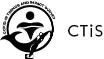
Version 1
Characteristics:
Fluid line represents wave of water and statistical graph
Whale is diving in water and firguatively in a graph in search of data


Version 2
Characteristics:
C-shape inspired by:
Circular ring-shaped graphs
Whale sonar/radar device
Negative space represents various concepts:
Scanning sonar device
Beacon
Data point
Magnifying glass


Version 3
Characteristics:
Sun and water shaped like a person’s head and body
Emphasizes CTIS’ focus on participants for surveys and helping people

Version 4
Characteristics:
Water coming out of whale lifts “CTIS” up


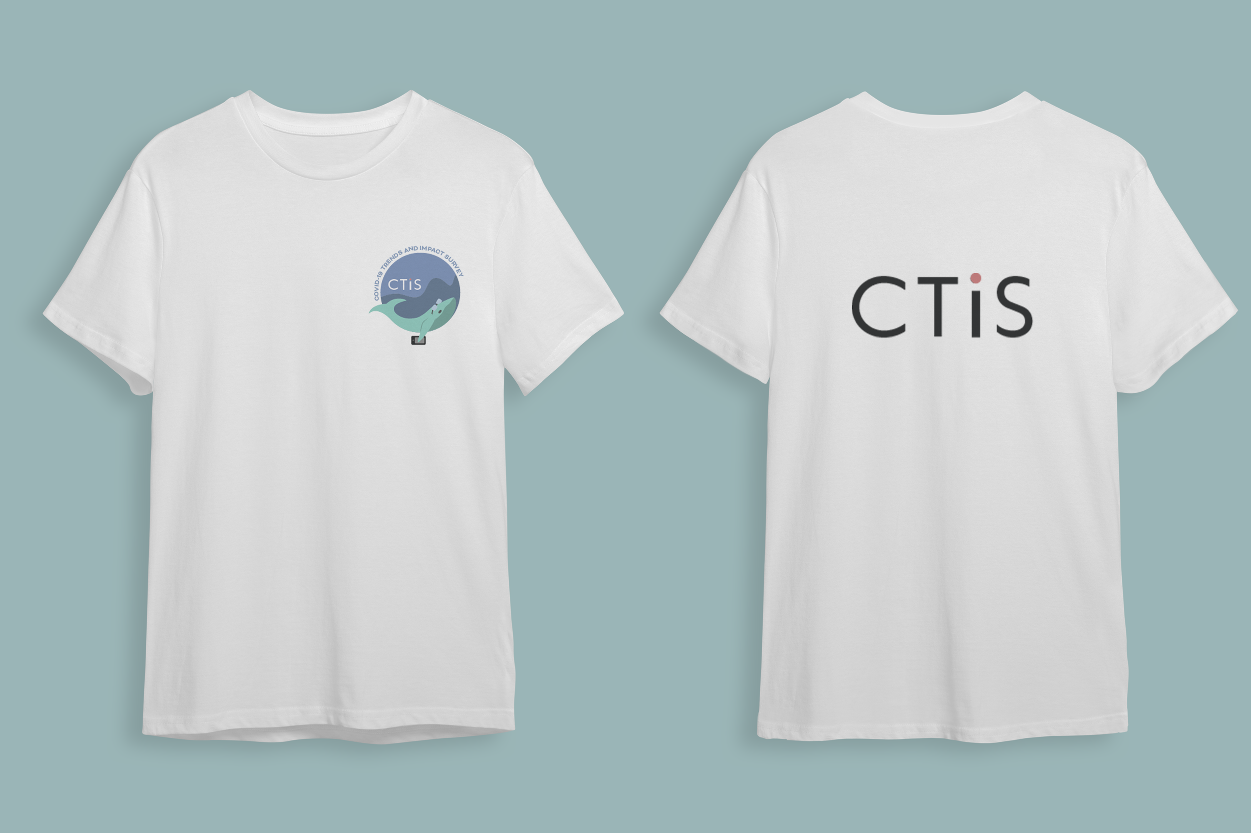
Logo & Mockup Comparisons
Logos
Mockup Designs


Final Design
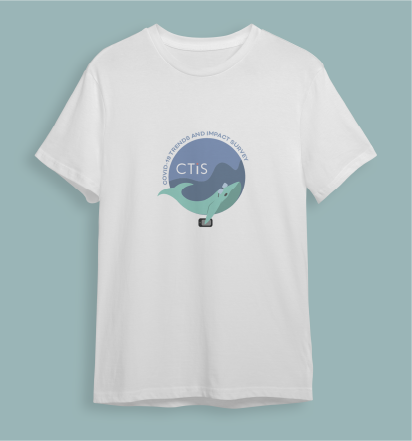
After the team reviewed the designs, they voted and discussed which official logo would be used to represent the their team. Ultimately, version 1 was chosen and used to put on their official team t-shirt.